The magic of colors: How Color Theory Transforms Children’s Stories
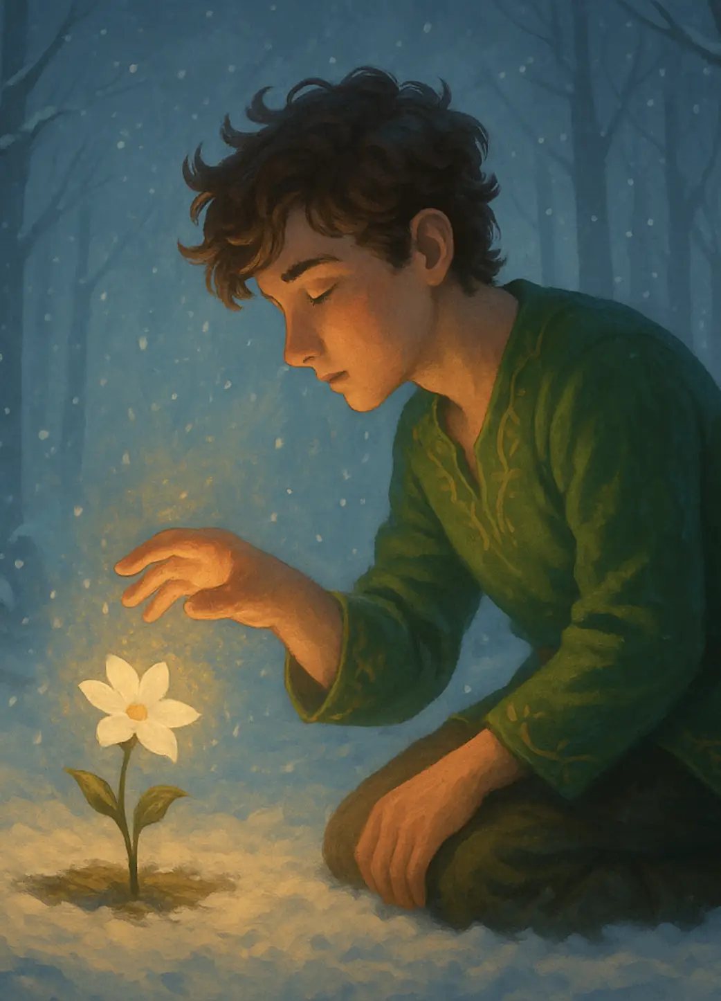
Have you ever wondered why certain colors in children's books captivate us so profoundly? Think of the vivid red cloak of Little Red Riding Hood or the calming blue sea in The Rainbow Fish. These colors do more than just fill the pages; they stir emotions, set the mood, and bring the story to life in ways that words alone cannot. In the enchanting world of children's literature, colors are the silent narrators, guiding young readers through a spectrum of feelings and adventures.
Understanding Color Theory
Color theory is the study of how colors interact with each other and how they can be combined to create harmonious compositions. It’s not just about knowing the names of colors; it’s about understanding their relationships and the feelings they can evoke.
Primary Colors are the foundational elements from which all other colors derive – red, blue, and yellow. They stand independently, each possessing distinct properties that cannot be replicated by mixing other hues.
Secondary Colors emerge through the fusion of primary colors:
- Orange exudes warmth and vibrancy.
- Green embodies freshness and renewal.
- Purple evokes mystery and sophistication.
Tertiary Colors further refine this spectrum by blending primary with secondary colors.
Complementary colors, like red and green, are positioned opposite each other on the color wheel and produce strong contrast when used together.
Analogous colors, such as blue and green, are adjacent on the color wheel and offer a harmonious effect when combined.
Choosing the Perfect Color Palette
Choosing the perfect color palette for children’s stories is more than just picking pretty colors; it’s about enhancing storytelling through visual appeal and emotional resonance. Understanding color psychology is crucial – warm colors like reds, oranges, and yellows evoke energy and excitement, while cool colors such as blues, greens, and purples create a sense of calmness and serenity. These emotional associations can help align colors with the mood and tone of your story, whether it’s an adventurous romp or a soothing bedtime tale.
Consider the theme and mood of your story when selecting colors. For adventurous narratives, vibrant primary colors and bold contrasts can ignite the imagination and captivate young readers. In contrast, for gentle bedtime stories, soft pastels like light blues and delicate pinks create a tranquil and comforting atmosphere that encourages relaxation and bedtime routines.
Characters come alive with color, defining their personalities and roles within the story. Heroes often wear bright, uplifting colors to signify bravery and positivity, while villains might be cloaked in darker, more foreboding hues like deep purples or blacks, hinting at danger or mystery. These color choices can visually reinforce character traits and plot dynamics, making the story more engaging and immersive for young audiences.
Age appropriateness is key in choosing colors that resonate with your target audience. Preschoolers and early elementary children respond well to primary colors and high-contrast combinations, which aid in visual engagement and cognitive development. Older children may appreciate a broader palette that reflects the complexity of themes and emotions in the story, maintaining clarity and coherence throughout the narrative.
Balance and contrast are essential in creating a visually appealing palette that guides the reader’s focus and enhances storytelling. Use contrasting colors strategically to highlight important elements such as characters or key story moments, while ensuring overall harmony to prevent visual overload or confusion. Select your primary colors as the foundation of your palette, balancing one warm with one cool tone or opting for two of either for harmony. Incorporate secondary and tertiary colors to add depth and highlight key elements. Neutrals such as black, white, and gray will balance your palette and provide visual relief.
Cultural considerations play a role as well—be mindful of how colors may be interpreted differently across cultures. Understanding these nuances helps avoid unintentional associations that could distract from the story’s intended message or themes.
Let’s Talk Colors
Here’s a look at how different colors can influence young readers:
🔴 Red
Red is a dynamic and energetic color. It symbolizes passion, excitement, and even danger. In children’s stories, red can be used to highlight moments of action and adventure. It captures attention and signals that something important is happening. Additionally, it can symbolize love and warmth, making it a versatile choice for both thrilling and heartwarming scenes. However, too much red can be overwhelming or convey aggression.
🔵 Blue
Blue is often associated with calmness, stability, and trust. It’s a color that can bring a sense of peace and safety to a story. Blue can depict serene lakes, trustworthy characters, or a peaceful night sky. In the world of children’s stories, blue often surrounds wise mentors and protective figures.
🟡 Yellow
Yellow is the color of sunshine and happiness. It radiates warmth and cheerfulness, making it perfect for lively, joyful scenes. In children’s literature, yellow can highlight moments of fun and playfulness. Furthermore, it can represent curiosity and creativity.
🟢 Green
Green is synonymous with nature, growth, and renewal. It is a color that can bring a sense of harmony and balance to a story. Green is often used in children’s stories to represent forests, meadows, and all things natural and alive.
🟣 Purple
Purple has long been associated with magic, mystery, and royalty. It’s a color that adds an element of the fantastical and the unknown to children’s stories. Purple can depict magical realms, mystical creatures, and enchanted objects.
🟠 Orange
Orange is a vibrant and lively color that blends the energy of red and the happiness of yellow. It is often used to convey enthusiasm, creativity, and warmth. In children’s stories, orange can be found in the playful characters and elements that add a burst of excitement to the narrative.

How to Create a Color Script
Understand your story arc
Break your story into key scenes or segments, noting emotional highs and lows, turning points, and the overall progression. This forms the foundation of your color script.
Choose a color palette
Select a cohesive color palette that aligns with your story’s tone and theme. Consider the genre, setting, and emotional undertones. For example, a fairy tale might use soft pastels for a whimsical feel, while a mystery might use darker, muted tones.
Assign color to emotions
Link specific colors to various emotions as mentioned earlier.
Map the color journey
Create a visual timeline of your story, marking significant scenes and transitions. Use your chosen colors to map out the emotional journey, ensuring that the color transitions support the narrative flow.
Highlight themes and motifs
Incorporate recurring colors to highlight themes and motifs. For example, if a character undergoes a transformation, you might gradually shift their associated colors to reflect their development.
Create storyboards
Develop storyboards for your key scenes, integrating the chosen colors. This visual representation will help you see how the colors work together and adjust as necessary. You can sketch these storyboards or use digital tools.
The main tips for effective color scripting are consistency, symbolism and experimentation. Try to maintain a consistent color scheme to ensure the story feels cohesive. Use colors symbolically to reinforce themes and character arcs. And most importantly, don’t be afraid to experiment with unconventional color choices. Remember, there’s no right or wrong when deciding on specific colors.
Mastering Color Harmony in Illustration
Color harmony is a fundamental technique in illustration, enhancing visual appeal and bringing a sense of balance to artwork. It refers to the aesthetically pleasing arrangement of colors, achieved through various combinations based on the color wheel. For illustrators, understanding and applying principles of color harmony is crucial to creating captivating and cohesive compositions that guide the viewer’s eye, highlight key elements, and evoke the intended emotional response.
Techniques for Achieving Color Harmony
Analogous Colors
One common method for achieving color harmony is using analogous colors, which are next to each other on the color wheel. This approach creates a serene and comfortable design, often used in scenes depicting nature or calm environments. For example, an illustration of a forest scene might use shades of green, blue-green, and yellow-green to create a cohesive and tranquil atmosphere.
Complementary Colors
Another technique involves using complementary colors, which are opposite each other on the color wheel. This combination offers high contrast, making an illustration more vibrant and dynamic. For instance, a sunset scene could use complementary colors like orange and blue to highlight the sky’s vivid hues and the landscape’s silhouette.
Color Contrasts
Color contrast refers to the difference in visual properties such as hue, lightness, and saturation between different elements in an image. In simpler terms, it’s how distinct one color appears from another when placed next to it. Color contrast is essential for story illustrators as it enhances emotional resonance, guides visual hierarchy, and ensures clarity and differentiation among characters and settings.
Types of Color Contrast
Saturation Contrast: High visual contrast achieved by using fully saturated colors without any mixing with black or white.
Temperature Contrast: Contrast between warm colors (reds, oranges, yellows) and cool colors (blues, greens, purples), enhancing visual impact based on color temperature.
Simultaneous Contrast: When a saturated color appears next to a gray background, it creates an optical illusion where the gray takes on a tint of the color’s complement. For example, placing red next to gray might make the gray appear slightly bluish.
Proportion Contrast: Contrast achieved by varying the sizes or areas occupied by different colors, creating a visual impact based on quantity.
Light-Dark Contrast: Contrast between colors based on their brightness or tonal value, enhancing visibility through lightness or darkness.
Complementary Color Contrast: Contrast between colors directly opposite each other on the color wheel, such as red and green or blue and orange, which intensifies each color when placed together.
Quality or Hue Contrast: Contrast based on the saturation or intensity of colors, where vibrant colors appear more vivid when placed near dull or muted colors.
Using Colors to Capture Attention
Contrast
Once again, contrast is very crucial to highlight important elements that stand out. For example, a bright character against a darker background will naturally draw the eye.
Color Emotion
Utilize colors that evoke specific emotions. For instance, warm colors like reds and oranges can convey excitement or energy, while cool colors like blues and greens can evoke calmness or tranquility.
Focus on Key Objects
Use a limited palette for most elements but make key objects or characters more vibrant or unique in color to make them stand out.
Hierarchy
Establish a color hierarchy where important story elements are given more saturated or brighter colors compared to less important elements.
Color Symbolism
Use colors symbolically to reinforce themes or character traits. For example, a villain might be associated with darker, more menacing colors, while a hero might have brighter, more heroic colors.
Use of Light and Shadow
Enhance the use of color by incorporating light and shadow effects. This can add depth and further highlight important elements.
Consistency
Maintain consistency in color use throughout the story to create a cohesive visual narrative. This helps in guiding the reader’s attention effectively.
Visual Cues
Use colors as visual cues to guide the reader through the story. For example, using a specific color to indicate changes in setting or mood can help children understand transitions better.
Conclusion
Color theory in children’s stories is a magical and essential aspect of storytelling. Each color brings its own unique touch, transforming simple tales into vivid, emotional journeys. By understanding and appreciating the role of color, we can create richer, more engaging stories that resonate with young readers and stay with them long after the last page is turned. So next time you open a children’s book, take a moment to appreciate the rainbow of colors that bring the story to life, and remember that each hue has its own special tale to tell.