Design Beyond Diagnosis: The Quiet Revolution of Universal Design in Print
For decades, the conversation around accessible books largely centered on necessary, yet separate, solutions: large print, Braille, or audiobooks. These accommodations are vital, but they often approach accessibility as an afterthought, a modification made after the core product is designed.
A quiet but profound shift is underway in the publishing industry, particularly in trade children’s books, led by design ethicists and accessibility advocates. This movement is integrating Universal Design (UD) principles into the very fabric of the physical book, transforming the reading experience for all. This is not just a technical upgrade; an ethical commitment to the belief that literacy is a human right, and exclusion from a book is a failure of design, not of the reader.
Moving Beyond the “Special” Category
Universal Design, which originated in architecture, dictates that environments and products should be usable by all people, to the greatest extent possible, without the need for adaptation. Applying this to print means moving beyond the often-stigmatizing label of “special needs” books and toward truly inclusive design.
The focus is no longer on retrofitting a product for a specific diagnosis, but on designing a book that is simply better for everyone.
1. Specialized, Dyslexia-Friendly Fonts
Standard fonts like Times New Roman or Arial were designed for aesthetic balance and efficient printing, not for readers whose brains struggle with visual processing and letter recognition. Specialized fonts address these core challenges:
Feature
Design Implementation
Benefit for All Readers
*Example: Fonts like OpenDyslexic or the proprietary typefaces developed by publishers show a clear, deliberate investment in legible letter anatomy.
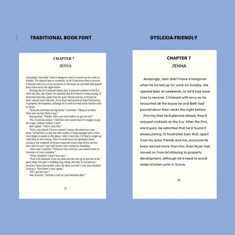
2. Optimized Text Block Architecture
The way words are spaced and arranged on a page can make the difference between effortless reading and debilitating visual stress.
Line Spacing (Leading):
Publishers are utilizing increased leading (the vertical space between lines). Tight leading causes visual crowding, a significant barrier where lines merge optically, causing a reader to lose their place frequently. Generous leading helps the eye track horizontally across the line and transition smoothly to the next.
Word and Letter Spacing:
Small, measured increases in the space between words and individual characters (tracking) prevent text from becoming a dense, intimidating wall of black ink.
Alignment:
Avoiding justified text (where text aligns perfectly on both the left and right margins) eliminates the awkward, varying spacing gaps and “rivers” of white space that can distract and disorient readers. Ragged-right margins are more universally readable.
3. Paper and Contrast Engineering
The choice of paper and ink is crucial for visual comfort.
Contrast, Not Glare:
Stark black text on pure, bright white paper creates high contrast, but also high glare. The glare can trigger visual stress (sometimes called Scotopic Sensitivity Syndrome) in many readers. Universal Design favors a high-contrast text color (a rich black) printed on a low-glare, matte paper in a subtle off-white or cream tint.
Weight and Show-Through:
Using a heavier paper stock reduces show-through (where text from the reverse side bleeds visually through the page), which further reduces visual clutter and confusion.
The ‘All-Benefit’ Advantage: Designing for the Extremes
The genius of Universal Design lies in its “curb-cut effect.” The curb-cut was designed for wheelchair users, but it benefits everyone: parents with strollers, delivery workers with dollies, and travelers with rolling luggage.
Similarly, designing a book for a child struggling with dyslexia creates a better book for every reader:
Children Building Fluency | Reduced visual fatigue, faster decoding, and less frustration. The clear visual tracking helps them establish reading rhythm. |
Readers with Low Vision/Visual Stress | High contrast, generous spacing, and low-glare paper make reading physically comfortable and sustainable for longer periods. |
English Language Learners (ELL) | Simplified layout and reduced cognitive load allow learners to focus their energy on comprehending the language rather than fighting the design. |
Fluent Adult Readers | A more comfortable, less fatiguing experience, especially when reading late at night or under suboptimal lighting conditions. |
When publishers integrate these features, they are not creating an accommodated product; they are setting a new, higher standard for reading quality. They showcase a commitment to literacy as an ethical cornerstone of their business.
The Next Step: Holding the Line on Ethical Print
This is more than a trend; it’s a foundational shift in design ethics. By demanding and supporting books that inherently include all readers, we move beyond segregation and towards a truly equitable literary landscape.
The quiet push for Universal Design in Print is demonstrating that what is essential for some is invariably better for all. It’s time for this technology-driven and ethically motivated approach to become the industry default.